Thursday, 3 November 2011

Album photo ideas


The writting for this idea, came from the Baby Shambles album i blogged about earlier on. The lettering style is similar to a murder note made from magazine cut outs, and this could connote the genre of our music video.


We have started to play around with photoshop and edit our images ready for our digipack. Alice and i have worked together on the style we wish to develop, and have agreed that the tones and colours will portay a retro sepia genre, to collaborate with the indie style of music.

Looking at different tones and styles, we researched other known albums with similar ideas to our own, to see what effect the colour scheme had on the connotations of the album.

I think the blue pixelated filter, draws on the hollowness of the females face, and the imagery suggests the album will be mornful or sorrowful.

This Rolling Stones album cover has a similar theme to our own music video, and the potrayal of grime gives a narrative that tells the audience the music genre. Also the orange glow makes it look old, and alternative in style.

The opacity level makes this album cover mysterious, and some what dated. The idea of fading out the image to date it, indicates a more taper player/record player style of audience.

Regardless of the genre (which i havnt researched) this particular album could possibly be categorised by its colour shceme. the icy greens and blues connotes a jazzy feel.


Wednesday, 2 November 2011

Album posters


Album posters advertise the release date and the album name, along with album imagery or artist imagery.

Feedback

My poster reasearch was relevant but not completly on task as the ones i researched were gig posters, not album posters.. however i think the posters are helpful in giving me ideas for imagery, and i like the way the majority of them are illustrated.

Friday, 28 October 2011

Poster Research


Its come to my attention that less is definatly more when it comes to advertisments, and to create a good poster you have to have captivating imagery. Not one of my above posters shows the band, but illustrations of the album. Their not over crowded with information, and most of them display info withid the imagery.

From this i can conclude that its probably a good idea to avoid photo shoots with the artist, as posters are often displayed to sell an album, so its best to promote album images on the poster!

SATURDAY 1st OCTOBER FILMING EVIDENCE

We did the narrative side of our filming at the beggining of the month and it was a successful shoot. We used our blogged location, and our actor was really willing to do exactly what we wanted. The filming process was long and slightly tedious as times, as with very little running water, it took us nearly an hour and a half to fill a bath with cold water. Ezgi was fab tho, and she was happy to do take after take, whilst sat in a freezing cold bath, in a house without heating or electric, at a nightly hour of about 7 o'clock!

The bath scene from Britney Spears pop video 'Everytime' inspired us to do a similar shot as we felt it succesfully connoted a suicide in a managable and well constructed manner whithout offending its audience, but at the same time suggesting an imbalance in her life. I think here we have achieved a good representation of the conventions of an emotional media product
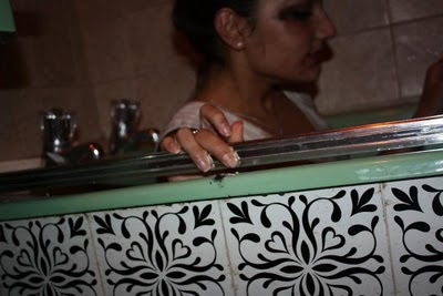
this shot is evidence of our filming about to shoot the scene where Ezgi goes under the water in the bath, this follows the same image as below taken from the Britney Spears video.


Album imagery

I like the idea of symbolism, and using a ciggarette to mark a moment in the music video
I think fading the image out or making it sepia, creates a very vinatge/retro/indie feel
Using our female on the front cover gives the album narrative, and i like the idea of using her to sell the genre of music.

 This album mixed black and white imagery with colour and that is an idea that we could develop on, to draw focus on different areas of the album.

Images we are considering to use are as follows..


 I have edited the photo of ezgi to make it into a mixture of black and white and colour. I like the way this centres the image, and shows the fade from colour to black and white as you move down the image.


On this image i played around with a bit of sepia mixed with back and white, and i then soften the background and sharpened ezgi. To create the black edge, i lomo-ished the image, and this was what i ended up with! 


 For this one i struggled for a while to mix all the effects together but i got there in the end. I blured the image and then created a focal soften around her left eye. I then used a focal B&W to make her face coloured and the back ground more black and white.


To get this edit, i faded the edge, and used brown and yellow duo-tone to edit the colour. I also sharped the edge of the bath, to make it whiter on one side.

Artist and album

Markus Pearce will be the name of our artist, and the album will be called Scattered Souls. Alice created the artists name, and we decided on Scattered Souls becuase we thought the song drew on these sorts of connotations, when talking about two people divided by death but in love with one another.